When I got married I decided to produce the stationery myself, working this way was the best idea for getting things done the way we wanted and on budget.
It was also a rare opportunity to get stuck in on an extensive project that would stretch across a few months and allow me to push out of my comfort zone as a designer.
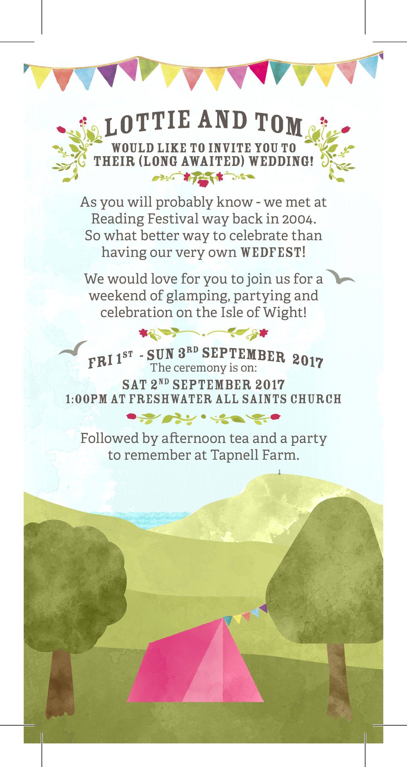
We had decided to have a three-day festival themed wedding; I always feel a one-day wedding is only enough time to shake hands and go home again.
So with 18 months to go, we had our venues and our basic theme – a festival with more of an afternoon tea/village féte feel.
The first element was a logo. I wasn’t sure whether weddings should have logos, but this was my wedding so it was having one.
The cow was based on the venue of the reception which is festooned with vibrant fibreglass cows.
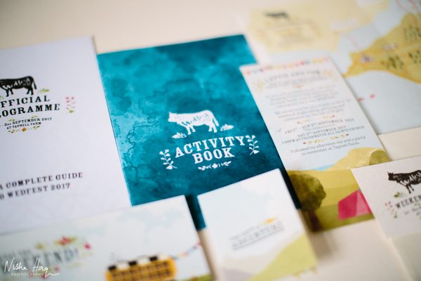
We decided that the best things to receive in the post are tickets, and as we were aiming for a festival themed wedding we thought it would be great to create fitting invitations that would help build a sense of excitement (and answer the myriad of questions that were already being levelled at us). With that in mind, I set to work on creating a pack of elements that would give all the information we had, as well as being themed around things you would find at a festival.
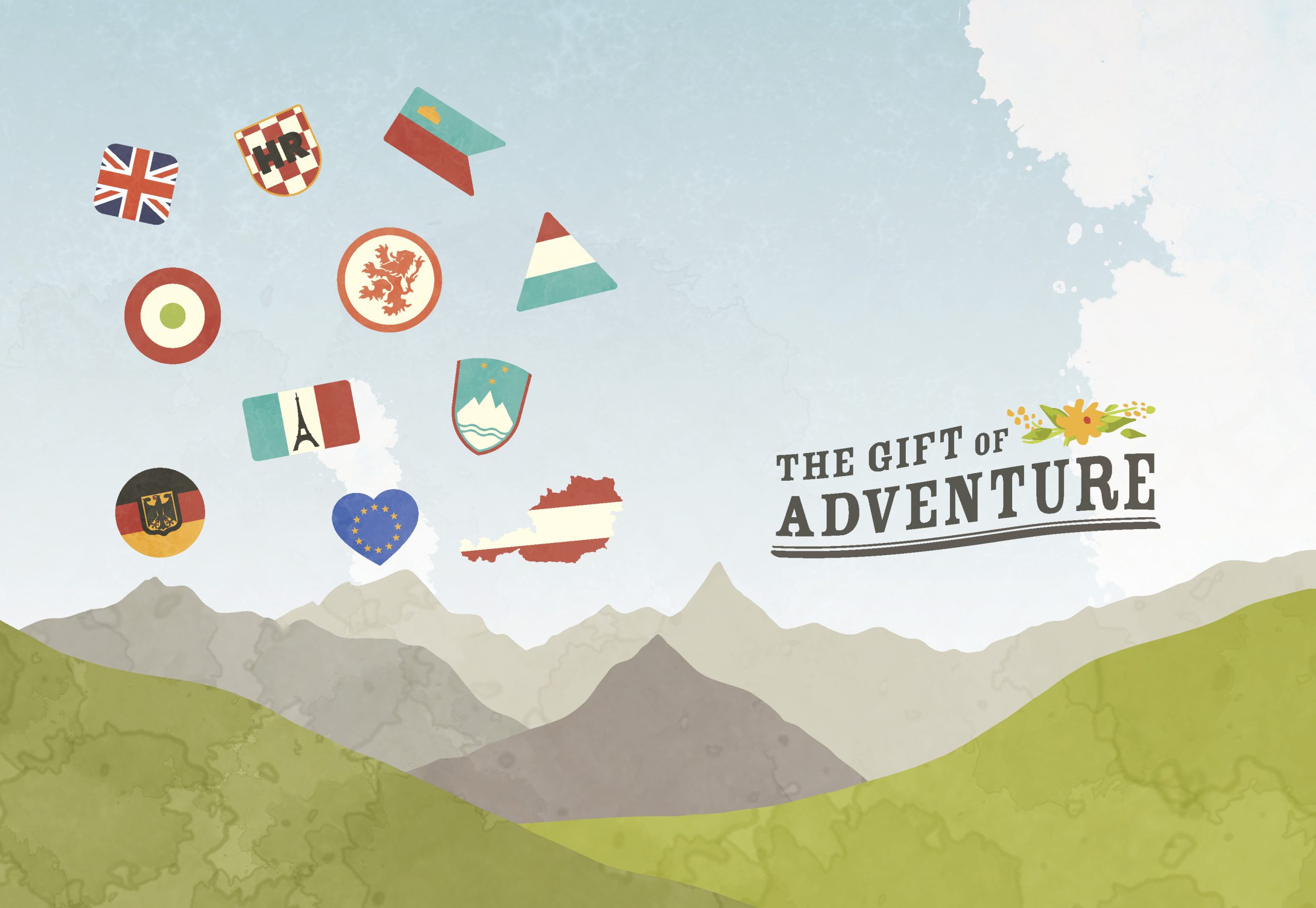
I started with a map, a purely visual element that would help dial in on the visual ID of the event.
This was by far the hardest part of the project, as I worked with a host of traditional and digital mediums to find a style that felt right for the event.
On the back of this, I laid out the travel information, which also gave us a chance the nail down the tone of the copy.
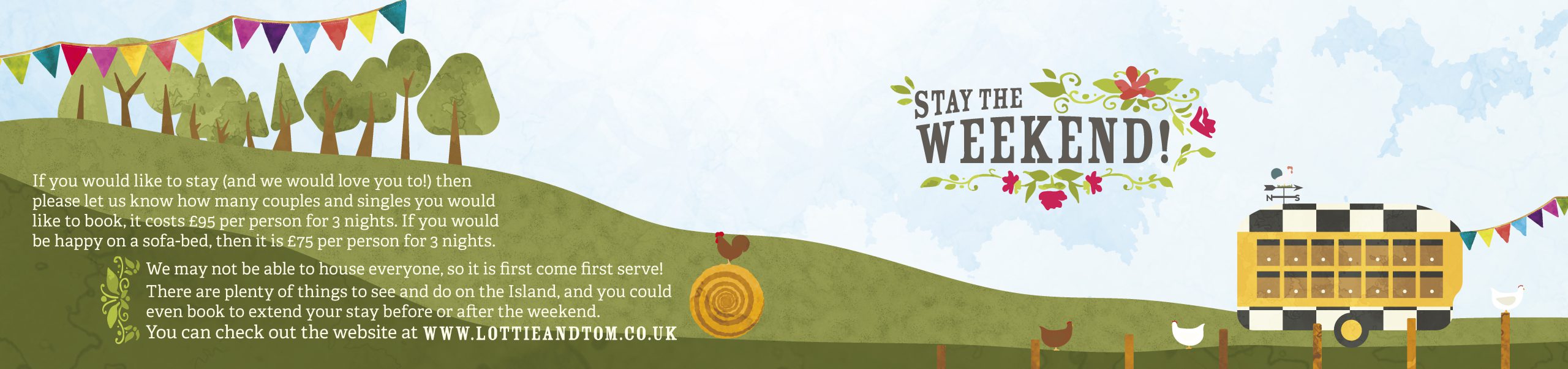
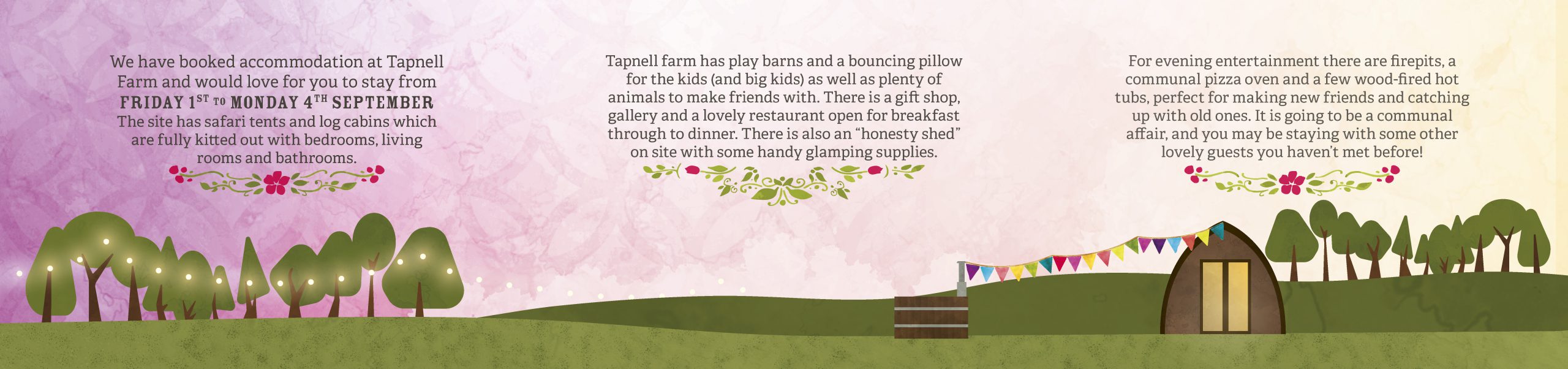
So the style and tone were both sets, which meant we could have a bit more fun on the other elements, which we broke down into several parts: The actual invitation, an RSVP ‘ticket’, information on accommodation, and info about gifts. In short, all the information should be in one pack, with a visual theme stretching across the range of materials.
I printed these on a mix of stocks, with the ticket being printed on 450gsm watercolour paper, and the rest printed on wallpaper/lining paper which meant the cost was kept down and the natural inclusions of the paper added to the texture of the pieces.
For an order of service I created a ‘Programme’ that would guide our attendees through the entire weekend.
Whilst I was creating this, we thought it would also be a good idea to create something for the children to do, as there would inevitably be parts of the day that would be a bit boring for them.
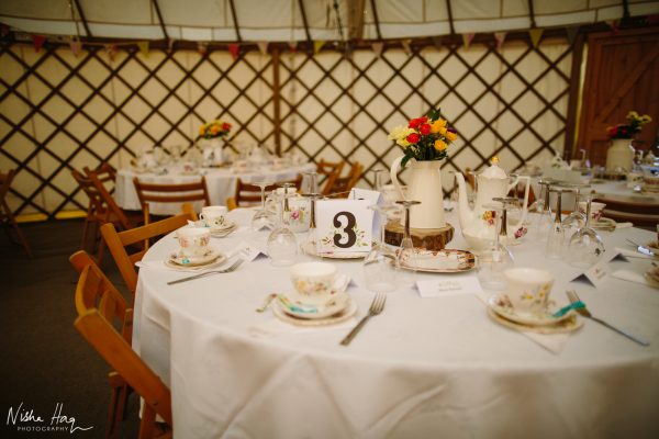
N.B. A huge thank you to the fabulously talented Nisha Haq of nishahaqphotography.com for sending me these photos and letting me use them here. She was our photographer (and guest!) on the day and, as you will see below, captured the essence of the day perfectly.
To support all of these elements I created a website, with assets created and pulled from the other pieces.
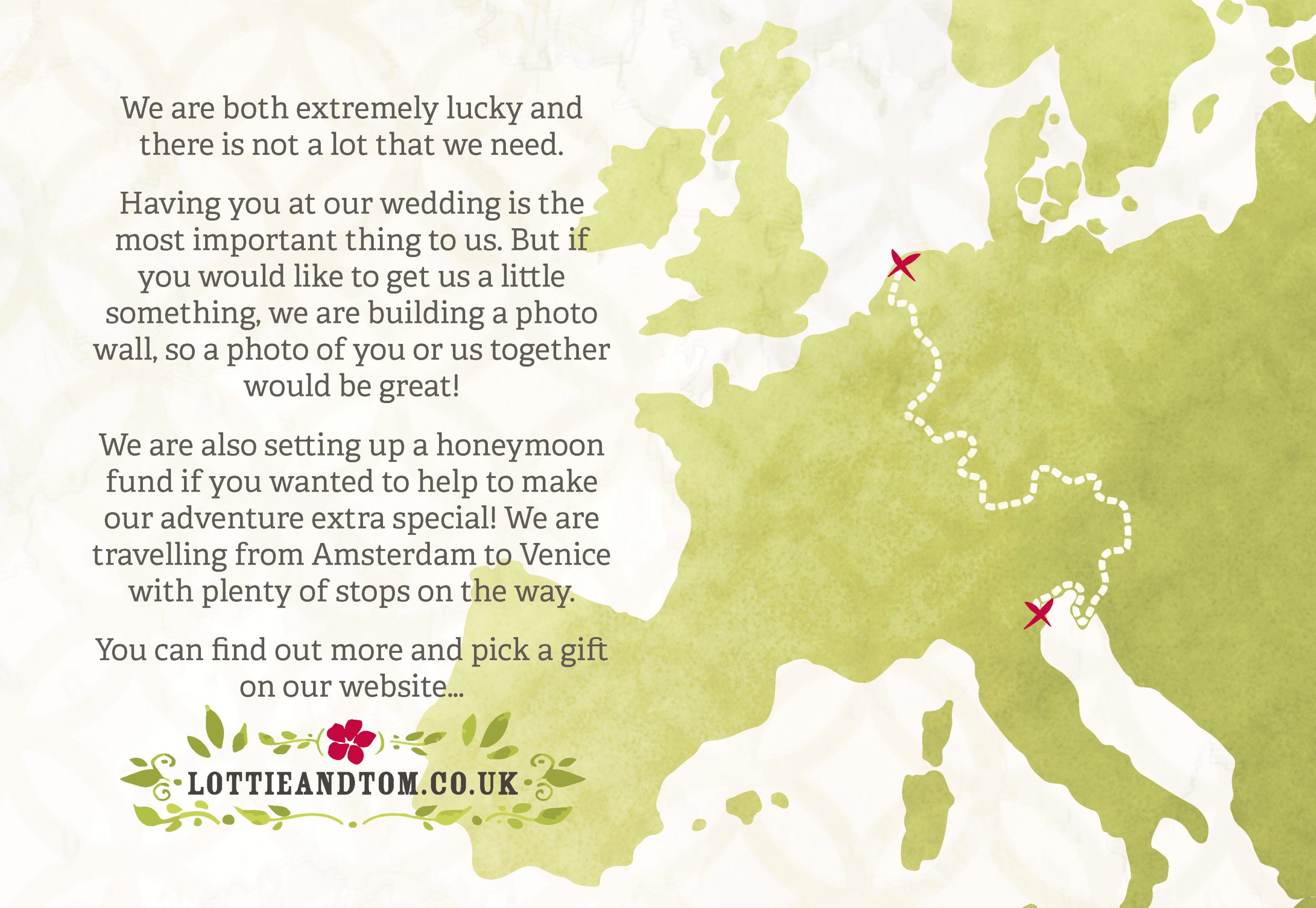
The site played an integral part of how we wanted to communicate with our guests leading up to the event, create an easier way to RSVP, it also gave us a portal through which we could also collect funds towards our honeymoon.
The final element was our wedding favours themselves because every festival needs a good wristband.
We opted for woven wristbands, which allowed for 5 colours.
The result of all this? A Visual ID that made sure all the elements fit together seamlessly, and a pretty good day.


